Ακολουθήστε τους κανόνες εταιρικής ταυτότητας του Simply όταν χρησιμοποιήτε τα Simply brand assets
Simply λογότυπο
To Simply λογότυπο είναι η καρδιά της εταιρικής ταυτότητας και επικοινωνίας της Simply και είμαστε ιδιαίτερα προσεκτικοί στον τρόπο που το χρησιμοποιούμε ανάλογα με την εκάστοτε εφαρμογή
Χρωματικές επιλογές
Το Simply λογότυπο μπορεί να χρησιμοποιηθεί μόνο βάσει μίας απο τις ακόλουθες χρωματικές εκδοχές
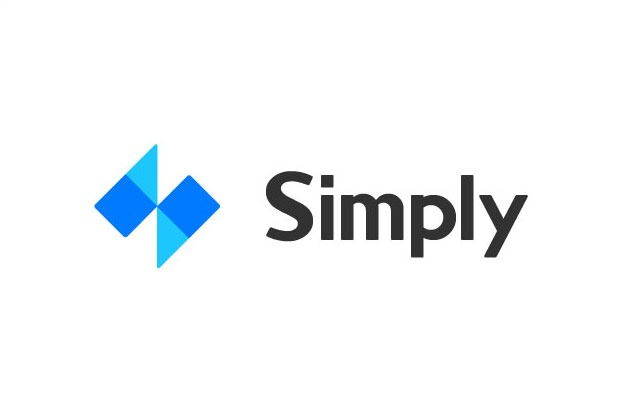
STANDARD BLUE LOGO
The standard blue logo is the preferred format. To be used solid colored backgrounds. Choose the variation with the most contrast to the background.
HEX #007AFF CMYK 78,53,0,0
STANDARD DARK GREY LOGO
To be used in newspaper print, greyscale designs. Choose the variation with the most contrast to the background.
HEX #404040 CMYK 68,61,60,47
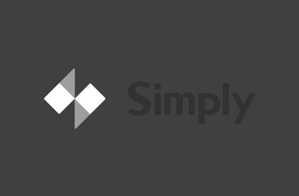
STANDARD LIGHT GREY LOGO
To be used as a watermark on white or light, solid coloured backgrounds. Choose the variation with the most contrast to the background.
HEX #D2D2D2 CMYK 17,13,13,0
Μέγεθος λογοτύπου και αποστάσεις
Είναι απαραίτητο το Simply λογότυπο να εμφανίζεται σε σωτό μέγεθος με τηρούμενες όλες τις αναλογίες μεγέθους προκειμένου να είναι πάντα αναγνωρίσιμο.
MINIMUM CLEAR SPACE
The space on all double sides should equal the half height of the ‘m’ in the logo. The distance between the left and right parts of the logo is equal to the height of “m” in the logo.
MINIMUM SIZE
Logo minimum size for print is 22 mm x 8 mm.Logo minimum size for web is 88 x 32px.
Τι να μην κάνετε
Μην παραμορφώνετε, χρωματίζετε, περιστρέφετε, αλλάζετε φόντο και φυσικά μην “βάζετε” πάσης φύσεως εφέ στο Simply λογότυπο
DON’T STRETCH THE LOGO
Keep the logo to the aspect ratio in the file.
DON’T CUT OUT THE TEXT
Do not cut the text out of the logo to show the background colour. The “Simply” text shouldn’t be edited from the colour supplied.
DON’T ROTATE THE LOGO
Keep the logo horizontal, in a landscape orientation.
DON’T LOSE THE LOGO
Choose a logo that will contrast with the background and stand out.