By using the Simply Brand Assets you agree to accept and follow these guidelines
Simply Logo
Our logo is the heart of our brand and all our marketing initiatives. So, naturally, we’re a bit protective of our logo and ask that you treat it very nicely, as outlined.
Logo colour options.
Our Simply logo can be displayed in the following three colours and their inverse variation.
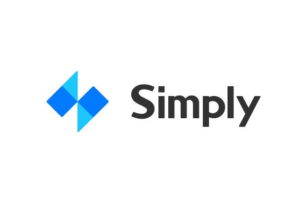
STANDARD BLUE LOGO
The standard blue logo is the preferred format. To be used solid colored backgrounds. Choose the variation with the most contrast to the background.
HEX #007AFF CMYK 78,53,0,0
STANDARD DARK GREY LOGO
To be used in newspaper print, greyscale designs. Choose the variation with the most contrast to the background.
HEX #404040 CMYK 68,61,60,47
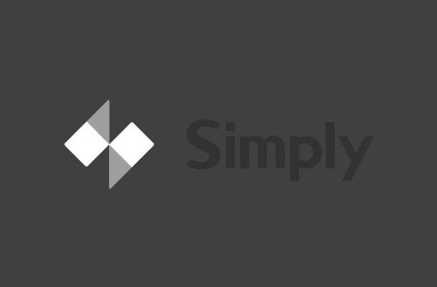
STANDARD LIGHT GREY LOGO
To be used as a watermark on white or light, solid coloured backgrounds. Choose the variation with the most contrast to the background.
HEX #D2D2D2 CMYK 17,13,13,0
Logo size and space
It’s important that the Simply logo is always large enough to be legible and is given space to breathe.
MINIMUM CLEAR SPACE
The space on all double sides should equal the half height of the ‘m’ in the logo. The distance between the left and right parts of the logo is equal to the height of “m” in the logo.
MINIMUM SIZE
Logo minimum size for print is 22 mm x 8 mm.Logo minimum size for web is 88 x 32px.
What not to do.
You wouldn’t like to be stretched, warped or washed out either.
DON’T STRETCH THE LOGO
Keep the logo to the aspect ratio in the file.
DON’T CUT OUT THE TEXT
Do not cut the text out of the logo to show the background colour. The “Simply” text shouldn’t be edited from the colour supplied.
DON’T ROTATE THE LOGO
Keep the logo horizontal, in a landscape orientation.
DON’T LOSE THE LOGO
Choose a logo that will contrast with the background and stand out.